I design complex B2B software and show the reasoning behind every screen.
Senior UX consultant with seven years on an enterprise compliance platform. I turn dense domain rules into calm, usable products, design AI features people can check and override, and hand developers designs they can build.
Clients upload policies and records as evidence for each audit question. Assessors reject weak evidence days later, and the client starts again. I designed an assistant that checks evidence on upload and explains exactly what is missing.
Confidential client work. Client data is left out. The intro screen is from the product; the results screen below is a simplified recreation using a generic password-policy example.
The problem
Each audit question comes with specific requirements, such as a minimum password length or a rotation period. Clients upload documents they believe cover it. If something is missing, they find out only when an assessor reviews it, often well after the upload.
An AI check at upload time could close that loop in seconds. The design challenge, before it went into development, was trust: clients had to understand why the AI flagged something, and assessors had to stay in charge of pass or fail.
Question 83 · Access controlProvide your password policy and supporting procedures.
AI assistant on for this question
Password Policy.pdf150 KB
Policy Procedures.pdf250 KB
Information Security Policy.pdf420 KB
11:30 · 3 gaps11:45 · 2 gaps
AI pre-check2 of 3 requirements not met
ObservationPassword length is set to 6 characters.RequirementMinimum length must be 8 characters.Password Policy.pdf · page 5 ↗
ObservationPasswords were last changed 120 days ago.RequirementPasswords must change every 90 days.Information Security Policy.pdf · page 7 ↗
MetPasswords require a special character.Policy Procedures.pdf · page 2 ↗
Re-upload evidenceAsk the assistant
From prototype 5, where the core concept was set; the shipped product has been improved in stages since. Every finding names the document and page it came from, so the client can check the AI's reading in one click. Each run is kept with its timestamp.
Process
01 Scenarios
Design the outcomes before the screens
Wrote out the paths before drawing anything: evidence passes; evidence fails every requirement; the client fixes part of it and re-uploads one file; the evidence doesn't mention a requirement at all.
Scenario boardState list
02 Opt-in
Let people choose the AI
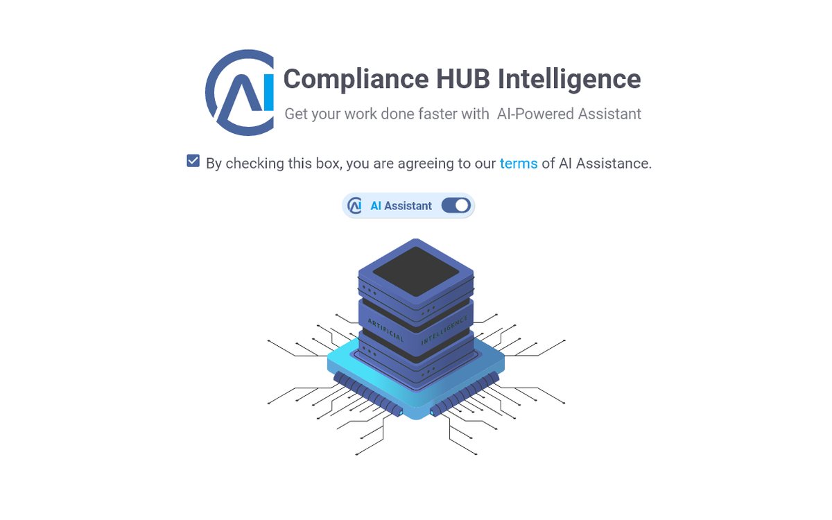
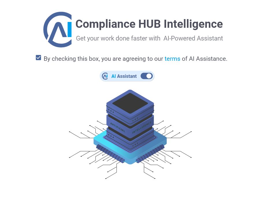
An introduction screen with an explicit agreement to the AI terms, then a per-question switch, so contributors decide where the assistant runs.
Intro screenAI on/off states
03 Results
Explain every finding
Designed the pre-check panel: in progress, success, and gaps, each gap paired with the requirement it misses and a reference to the exact page.
Pre-check panelGap cards
04 Recovery
Make fixing the fastest path
Re-uploading one file triggers a new check, and the gap count drops as requirements are met. Earlier files and earlier runs stay visible by date.
Re-upload flowRun history
05 Assessor
A second view for the expert
Assessors see the same pre-check results, with and without gaps, as input to their own review, not as a verdict.
Assessor viewsClickable prototype
06 Iterate
Core concept set, then improved in stages
Prototype 5 established the core idea that shipped: check on upload, explain each finding with a reference, let the client fix it, keep the assessor in charge. The product has been refined in several rounds since.
02All gapsThree of three requirements missed. Files still saved; the client is shown how to fix them.
03Partial fixThe client re-uploads one file. The new run shows two gaps instead of three; all files kept by date.
04Missing topicThe evidence never mentions a requirement. The AI says so, rather than guessing.
Decision log
DEC-01
Rename "Gap / Answer" to "Observation / Requirement"
Context
Early versions labelled findings as a gap and an answer. That read like the AI had graded the client.
Why
"Observation" describes what the AI saw; "Requirement" states the rule. Clients can judge the finding for themselves.
DEC-02
Cite the document and page for every finding
Context
An unexplained "fail" from an AI gets ignored or argued with.
Why
A reference lets users verify the AI in seconds, and catch it when it's wrong.
DEC-03
Save the evidence even when the check finds gaps
Context
Blocking the upload would put the AI in charge of what reaches the assessor.
Why
The AI advises; it never gatekeeps. The assessor still makes the pass or fail call.
DEC-04
AI is opt-in, per question
Context
Clients handle sensitive security documents and have different comfort levels with AI.
Why
Explicit consent up front and a visible on/off state on each question. No hidden processing.
Outcome and next steps
Shipped and in use
Developed from this prototype and used by clients during evidence collection.
Next: confidence and disputes
Show how sure the AI is on each finding, and let users flag one as wrong to improve the model.
Add a result
Placeholder: a measured effect since launch, such as fewer rejected uploads or faster reviews.
Reviewing firewall rules for an audit means reading thousands of rules, written differently by each vendor, and tying every risky one to a compliance control. I designed a workflow where AI does the reading and people stay in control of scope and findings.
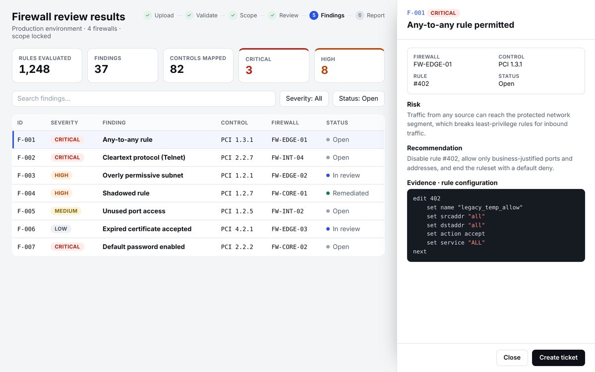
Confidential client work. Product names and real screens are left out; the screen below is a simplified recreation with sample data.
Step 5 of 6. Each finding links the severity, the control and the firewall to the exact rule that caused it, so a reviewer can confirm the AI's reading before opening a ticket.
The workflow
01UploadConfigurations from Fortinet, Palo Alto, Cisco and Check Point, plus archives and scope files.
02ValidateConfirms firewalls, vendors and parsed rules, and asks for anything missing before the AI runs.
03ScopeThe AI proposes what's in and out of scope; people edit it, then confirm and lock it.
04ReviewThe assessment runs on the locked dataset, with live progress.
05FindingsSeverity, control, firewall and status for each issue, with the rule as evidence.
06ReportReports per firewall plus a consolidated one, in PDF or Excel.
Decision log
DEC-01
Let processing run in the background
Context
Parsing large configurations and archives takes minutes, not seconds.
Why
People can close the window and keep working; an in-app notification tells them when results are ready.
DEC-02
Validate inputs before the AI runs
Context
A missing scope file would only surface as a confusing result at the end.
Why
A short checklist catches it up front and says exactly what to upload.
DEC-03
AI proposes the scope; people confirm and lock it
Context
Scope decides which rules count. Getting it wrong invalidates every finding.
Why
The AI does the detection, a person commits to it, and locking the dataset means every finding refers to the agreed scope.
DEC-04
Every finding shows the rule that caused it
Context
A finding without evidence asks the reviewer to trust the AI.
Why
The actual rule configuration sits next to the risk and the recommendation, so the reviewer can verify it in seconds.
DEC-05
Findings turn into tickets
Context
A report alone doesn't fix anything.
Why
"Create ticket" sits on every finding, so the review ends in action, with status tracked from Open to Remediated.
Outcome and next steps
Shipped
The six-step workflow is live, from upload to reports.
Next: override and confidence
Let reviewers mark a finding as a false positive or an accepted risk, and show how confident the AI is in each finding and in the detected scope.
Add a result
Placeholder: a measured effect, such as review time per firewall before and after.
Clients prepare for audits against several regulations at once. The work is to show how their own controls connect to those regulations without making them learn the data model.
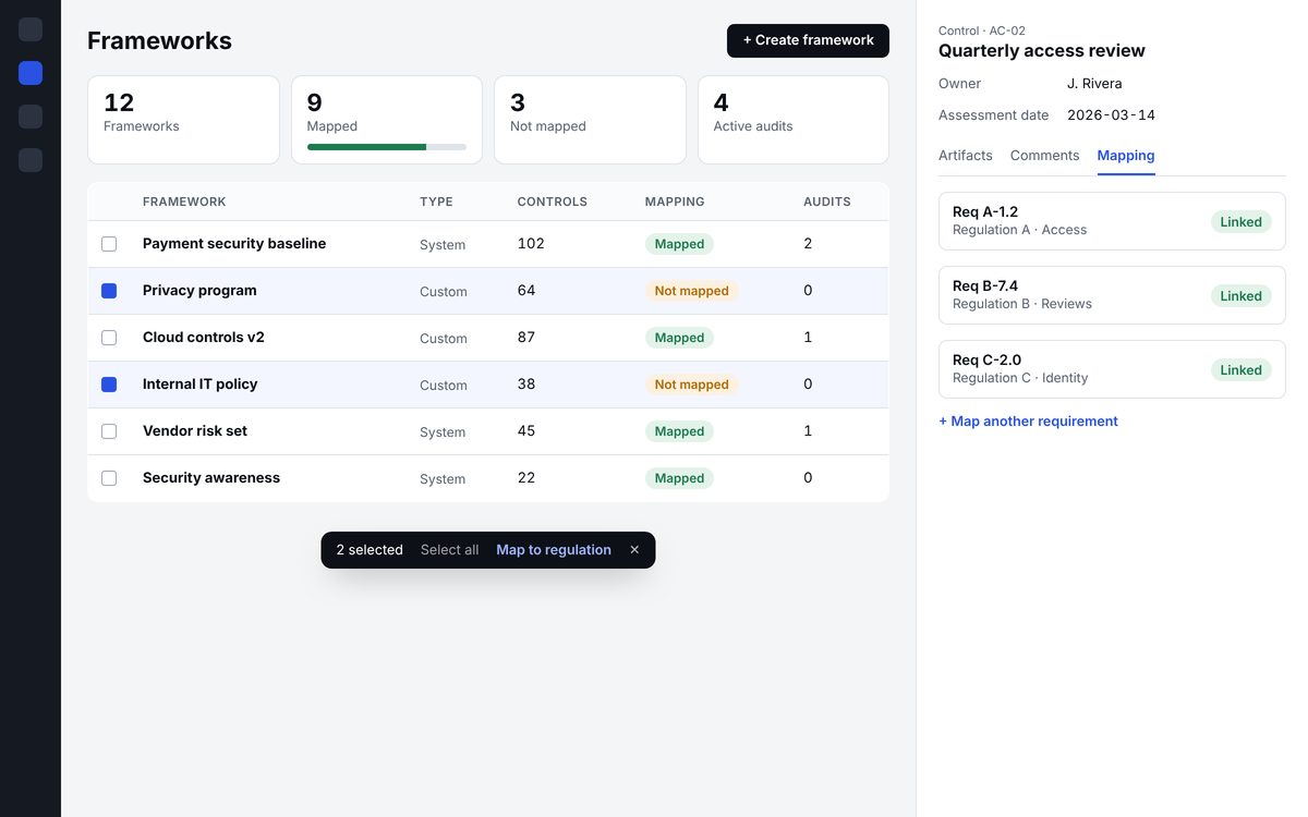
Confidential client work. Company names, data and real screens are left out; visuals here are simplified recreations.
The problem
Every regulation brings hundreds of requirements. Every framework a client sets up holds around a hundred controls. One control can satisfy requirements from several regulations, and one requirement can touch several controls.
The system could already do the mapping. The people using it could not see it: admins didn't know which frameworks were ready, and assessors had to leave their work to check how a control was mapped.
The model I mapped out with stakeholders before designing anything. One control can answer requirements from several regulations, so one piece of evidence counts more than once.
Process
01 Discover
Learn the compliance model first
Worked through regulations, requirements, controls, frameworks and audits with product leads until I could explain the lifecycle back: a framework is the setup, an audit is where evidence gets collected and assessed.
Domain glossaryEntity mapLifecycle notes
02 Define
Start from who logs in
The client admin lands on the Frameworks list. That made the list the most valuable screen in the feature, more than any new page.
User rolesEntry-point audit
03 Explore
Two directions, reviewed with leadership
Designed a standalone overview dashboard and a richer list view side by side, then put both in front of the VP. The review shaped the direction (see DEC-01).
Dark and light explorationsChart vs. table studies
04 Design
Build on shared patterns
Restarted the light version from my own guidelines: framework views, create-framework modals, controls screens and a control detail drawer, all built from one component library.
Figma component libraryVariablesFlows
05 Refine
Motion that informs, kept light
Added micro-interactions in a separate file. My first pass felt heavy, so I cut it back to quick, quiet feedback on selection, save and state change.
Interaction specsPrototype
Decision log
DEC-01
Put the overview on the list page instead of building a separate dashboard
Context
A new dashboard would add one more place to look, and the data already lived on the Frameworks list.
Why
Admins see the summary as soon as they log in. It also leaves less to build and maintain.
DEC-02
Mapping status is binary: mapped or not mapped
Context
A "partially mapped" state would invite questions nobody could answer at a glance.
Why
One clear status per framework, with detail available one click deeper.
DEC-03
Control details open in a side drawer, not a new page
Context
Assessors move control by control: owner, assessment date, notes, evidence, comments, mapping.
Why
The list stays visible, so they keep their place and their rhythm. Mapping sits in its own tab next to Comments.
DEC-04
Keep the floating bulk-action bar identical everywhere
Context
The same "N selected · action" bar appears across the product for many jobs.
Why
Consistency beats a per-page tweak. Users learn it once and it works the same way on every screen.
Outcome
One entry point
Framework health is visible on the screen admins already land on.
Fewer context switches
Control-level mapping and evidence live in one drawer.
Add a result
Placeholder: a measured result, such as support tickets, task time or adoption, once it is available.
The firm's files were spread across offices and folders. Letter templates existed in many versions, and no one shared a calendar. The owner isn't technical, so the system has to feel obvious from day one.
The problem
The firm's biggest pain was years of legacy material: templates, document reviews and case files with no single home. On top of that, deadlines lived in separate calendars across four offices.
The goal was a system staff would actually use. It had to start with their most frequent task and grow from there.
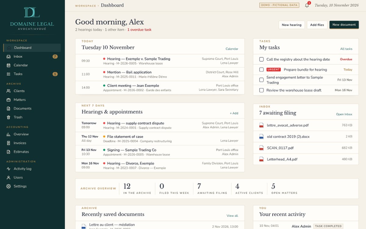
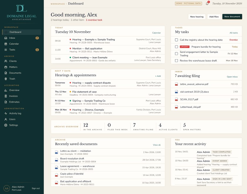
The dashboard each person sees on login: today's hearings, their tasks, the week ahead and files waiting to be filed. Shown with fictional demo data.
Process
01 Listen
Conversations with the owner
Mapped how a matter moves through the office, from intake to letter to invoice, and where things get lost.
Workflow mapPain-point list
02 Prioritise
Start with letters
Letters on the firm's letterhead were the daily, repeated task, so that became the first module: write, preview, save a PDF draft, send by email.
Module roadmap
03 Design
Two visual directions, one brand
Designed the system, then a second version in a different visual style for the same brand, so the client could react to real options. The dashboard is being redesigned in Figma next.
Figma flowsDashboard redesign
04 Build
Designer-led, AI-assisted build
Built and tested the app myself on the firm's existing hosting, with documents moving to cloud storage at launch. Kept infrastructure to what the firm can run.
Working appTest environment
05 On-site
Planned: a month with the firm
Next step is working alongside the team in Mauritius to import legacy files, train staff and adjust the system to how they actually work.
Rollout plan
Scope, in priority order
Letters on letterheadDocument archiveBulk import of old filesOCR for scansShared calendar & remindersTasksConflict checkRestricted filesEstimates, invoices, payments
Decision log
DEC-01
Design for desktop and iPad only, no phone layout
Context
This is office software, used at desks and in meetings.
Why
Effort goes into the screens people actually use. Dense document views get the space they need.
DEC-02
Reuse the invoicing engine for accounting
Context
The firm needed estimates, invoices and payments in Mauritian rupees, with 15% VAT that can be switched off.
Why
A proven engine from an invoicing app I built for a small business. Invoice PDFs file themselves into the document archive.
DEC-03
Client codes are generated but editable, and never printed
Context
Staff know clients by name or company, but the system needs a stable ID.
Why
Automatic by default, fixable by hand, and kept internal so client-facing documents stay clean.
DEC-04
Go live before adding an office suite
Context
I first considered adding a full productivity suite.
Why
It added cost and change without solving the core problem. Getting the system live came first.
Outcome so far
One home for files
Letters, documents, deadlines and billing in a single system across four offices.
Built to be learned
Started with a familiar daily task to earn trust before adding anything else.
Add a result
Placeholder: results after go-live and the on-site month, such as files migrated or time saved.
How I work
The same five steps on enterprise platforms and small apps. Only the depth changes.
01
Understand
Learn the domain and its rules until I can explain them simply. Complex products fail on the model before they fail on the UI.
02
Frame
Find who logs in first and what they need on that first screen. Choose the smallest valuable scope.
03
Decide
Show real options to stakeholders, then write down the decision and why. Each decision gets an ID so the team can refer back to it.
04
Design
Work inside a component library with variables, and keep shared patterns identical. Each significant change gets a new version, with the previous one kept intact.
05
Deliver
Hand off specs developers can build from. Review the build, then refine interactions until they feel light.
Design systems
Template first
I start projects from my own Figma framework: standard project pages (overview, problem statement, brief) and a branded component library.
AI-augmented
Designer who ships
I use Claude to explore, prototype and build working software, and hand designs to developers who build with AI coding tools. I'm training toward agentic UX: designing products where AI does part of the work.
Handoff
Built to be built
Every screen comes with its states, edge cases and the reasoning behind it, so developers don't have to guess.
About
I'm a senior UX and product designer based in Milton, Ontario. For more than a decade I've designed and built web and mobile products, most recently enterprise compliance software, where the rules are complicated and clarity matters.
I came to design with a front-end background, which is why I care about what happens after handoff. These days I spend much of my time on how AI changes the way products are designed and built, and I put it into practice on real projects.